Pani Pizza
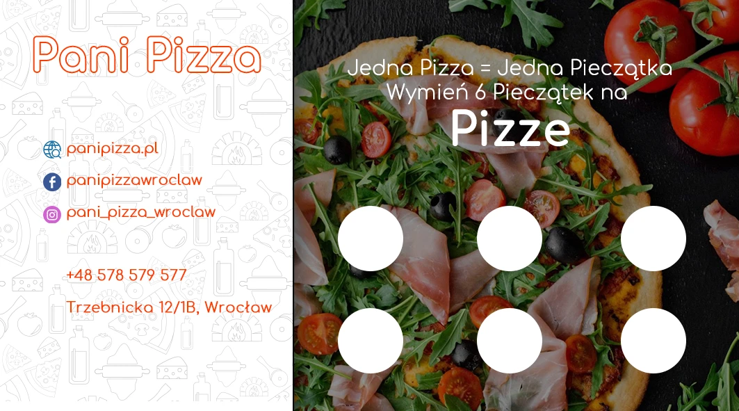
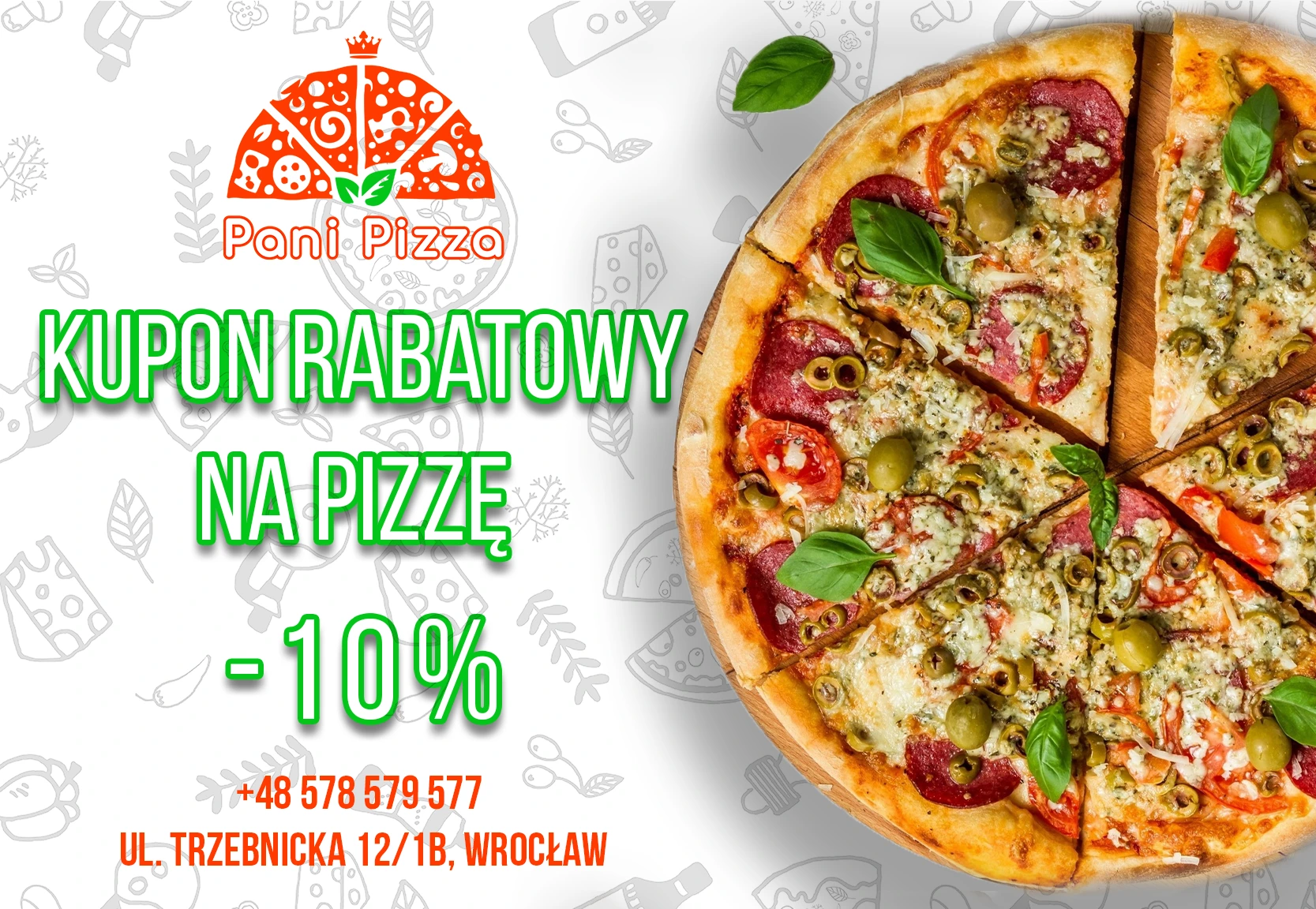
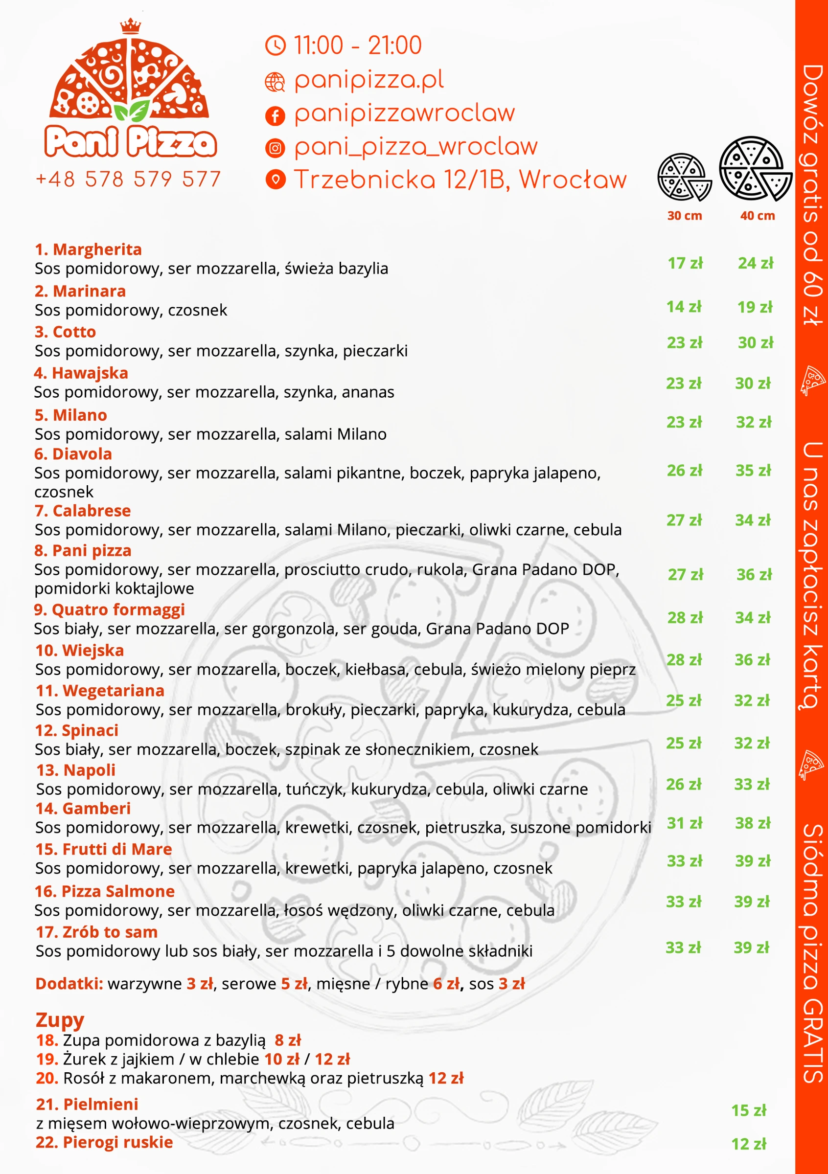
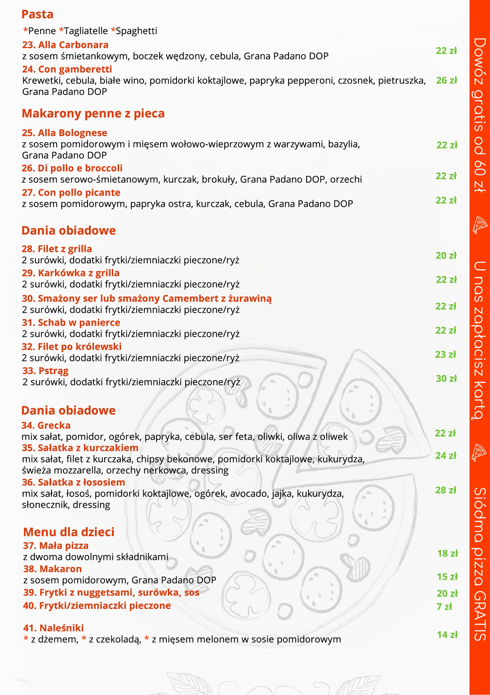
Pani Pizza: identity in everyday customer interactions. Business and loyalty cards, a flyer and menu, with packaging and signage visualisations.
Explore the story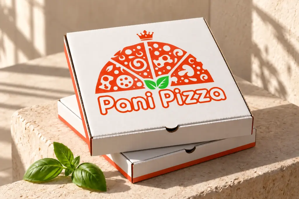
The project, the thinking and the outcome.
Project idea
The Pani Pizza identity design uses a fan of pizza slices, a crown, and basil leaves. The logo immediately connects the name with the product category and gives the brand a friendly, distinctive character.
Form and experience
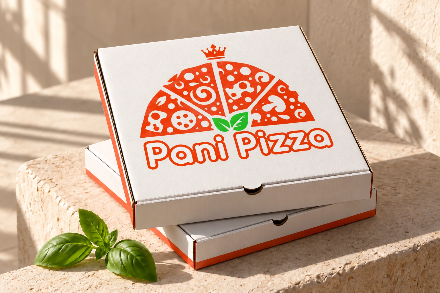
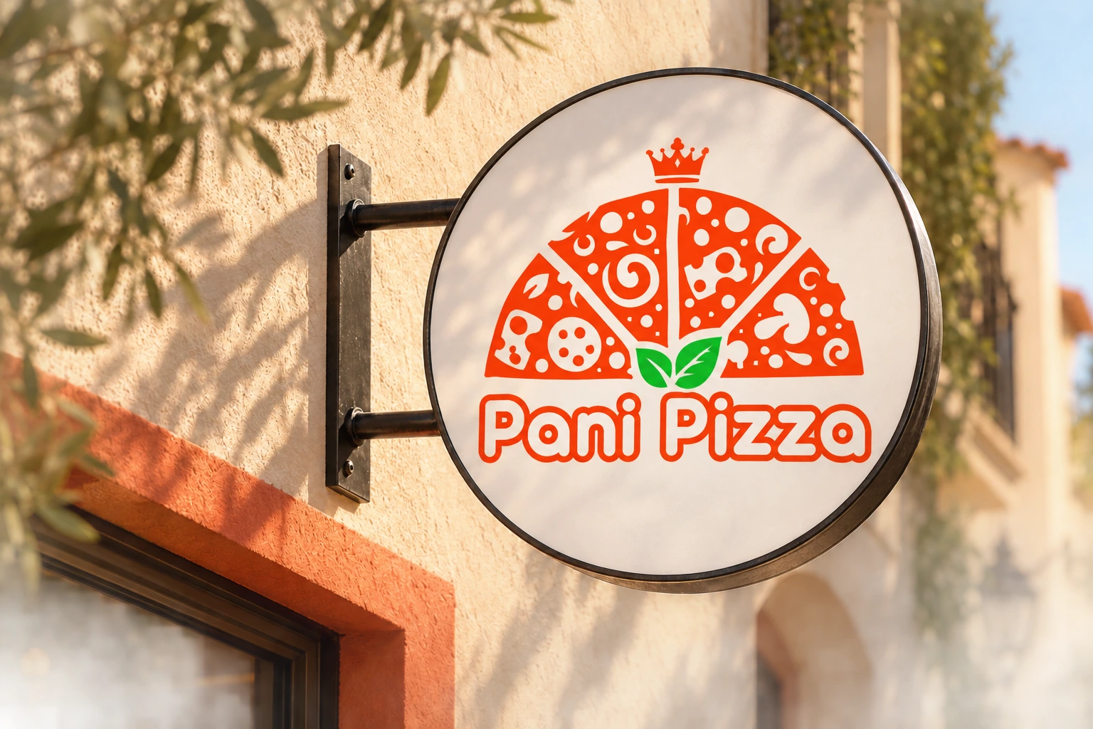
The orange-red palette and soft lettering form the basis of the presentation. Two scenes show the scale and application of the logo: close-up on the packaging and sign recognition in the environment.
What to see
- Conceptual visualization of the pizza packaging.
- Conceptual visualization of the round sign.
- A coherent identity across packaging, signage and printed materials.
From the first order to the next visit
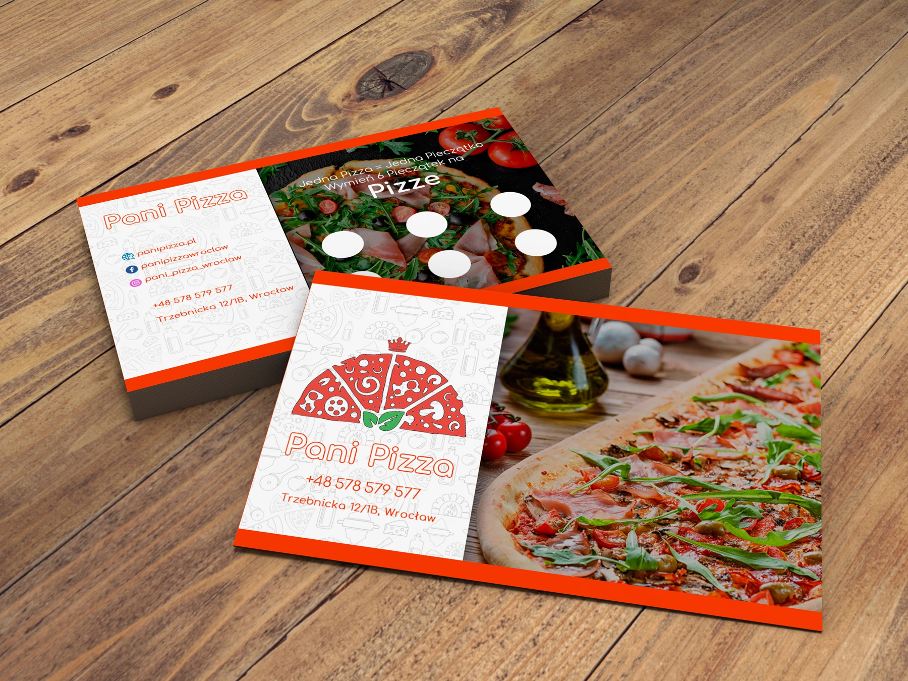
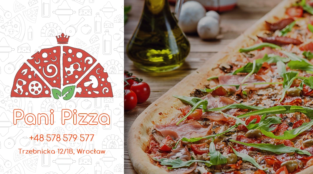
The business and loyalty cards, flyer and two-sided menu show how the brand’s mark and colours work in print. A readable menu structure, strong accents and consistent lettering bring the materials together as a recognisable set.
The work, in detail.
Explore the visual details, layouts and original artwork. Select an image to view it at full size.